If you’re running a business of any kind in 2022, then you surely must have a website. It’s nearly impossible to prosper now without an online presence and the help of digital marketing. If you want to scale your business and your goal is to expand your audience indefinitely, a website is a must.
But just having a website isn’t enough. Whatever niche you’re in, the internet is a vast place and there is plenty of competition. If you want to be noticed you need to be unique and what’s a better way to do that than by charming users with a next-level website design?
User interface and user experience design (UI and UX) are, in short, terms for the design of a product (a website, app, software, or a device) that focuses on providing the smoothest and most natural flow of actions.
If you want to learn about the newest trends in website and UI/UX design in 2022, read the article and get inspired!
Storytelling Elements
Storytelling in UI/UX design, also called scrollytelling, is an innovative and unique way of engaging users with the content of your website. Although it’s not a very universal technique as it is only suited for certain types of websites or businesses. There is one thing that can’t be denied, though. The visitor will not be able to take their eyes off that kind of design!
The design might not be ideal for e-commerce stores, although it could work for exclusive brands that take pride in their history. What the scrollytelling UX design is perfect for, instead, is learning websites. What’s a better way to show users the potential of your educational products than to take them on an interactive journey?
If you want to improve your copy for your ads, so that you have copy that converts, click here to read about 7 winning formulas for writing CTAs & headlines.
UI Design Customization
Customization is an integral part of a good user experience. After all, everyone has different preferences, even when it comes to web designs. The most popular, user-oriented websites offer plenty of customizable elements.
Let’s take Netflix, for example. The design is simple and almost minimalistic but it lets users choose what are their interests and what they want to see more of. In the case of film, music, or art websites, customizing your dashboard is crucial. And that’s why this design trend is becoming more prominent in other areas of UX.
Of course, sometimes personal interface customization is not possible. A product landing page serves a different function than an interactive shop or a social platform. However, if your platform’s purpose is, among others, to gather a database of users actively engaging with your content – a customizable design is a step in the right direction.
Dark mode
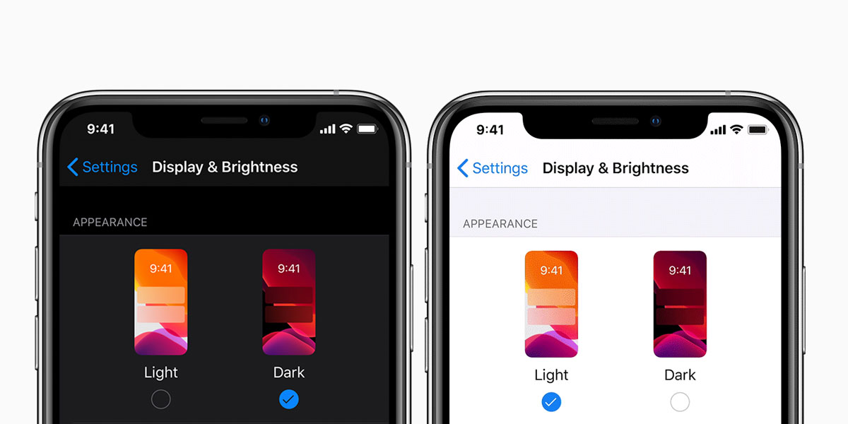
While UI design cannot always be fully customizable, a dark mode is a trend easy to follow. Nowadays, users seem to be especially interested in using a dark mode. Some prefer it for aesthetic reasons, some for extended battery life, and others want to spare their eyes from the strain of constantly looking at bright screens.
Either way, web designers have embraced that trend and an increasing number of websites now offer a dark mode. You too should follow in the footsteps of such giants as Apple and Facebook. Darker design is not only healthier for your eyes and your device’s battery life. It’s also pretty sleek.
Additionally, dark mode is a great way to add contrast and mystery to your web design. Be it a functional dashboard or an advertising product page, going dark is one of the biggest design trends for 2022.
3D Elements
Another one of the UI/UX design trends that are coming in 2022 is 3D elements. The trends that took the world of design by storm so far have been more on the flat and simple side. So, in order to stand out from the rest of the similarly themed websites, you should opt for some multidimensional design elements.
Additionally, if you advertise products on your website, a 3D preview is the next big thing. Customers love to take a very good look at the product they’re interested in before making a purchase. Adding some 3D design to almost anything can make it twice as interesting.
Just make sure you don’t end up mixing design styles that don’t go very well together. Our advice would be to avoid mixing design styles that might not compliment each other. 3D web design will add a sparkle to a minimalistic website but it might clash with realistic textures and organic elements.
Voice User Interface
Nowadays, accessibility is one of the most important aspects of a website. Just as adding alt tags to pictures helps people with vision impairment and blindness fully grasp the content of the website, the voice user interface does even more.
Voice User Interface allows people to interact with a website or an app by using voice commands. It’s also a UX design trend that caters to the busy …and the lazy. UX designers everywhere are taking notice of that trend and Siri is no longer the one and only virtual assistant.
Once again, it’s a design element that isn’t applicable everywhere. Sometimes the simplicity and function of a website make voice navigation a fancy but not necessary addition. Not every web design trend will pertain to your business and it’s important to tell the difference between the necessary and the cosmetic additions.
Color Branding for Web Design
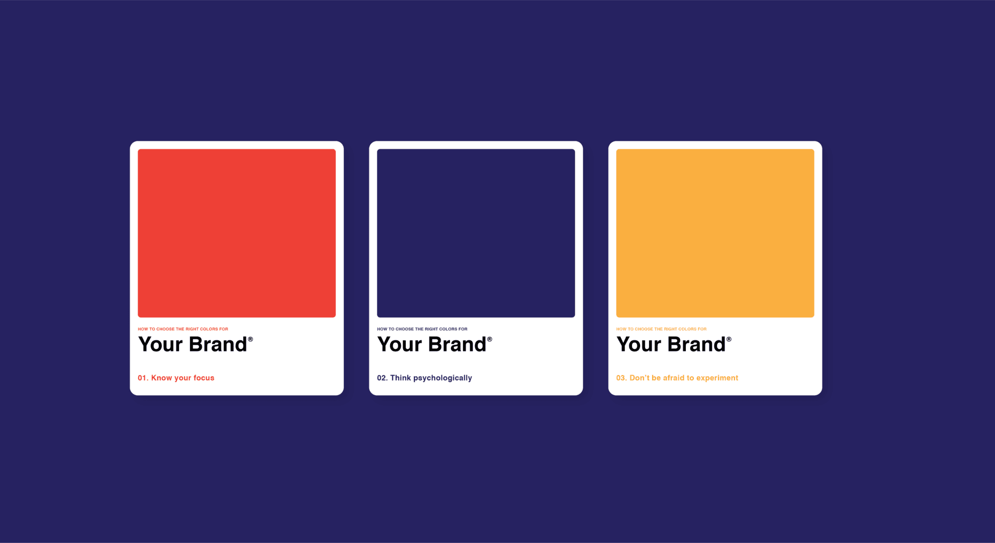
Color branding is not the latest UX trend but it’s something that every designer should know. If you think about it for a second, you must know at least one brand that you clearly associate with a certain color. That association is a great example of successful brand building.
It doesn’t matter if you’re a casual web user or a UI designer, brand colors are easily noticed and remembered, often subconsciously. What’s the color of Facebook? Blue. What’s the color of YouTube? It’s red. What about Twitter? That’s right, it’s blue again but a different shade than Facebook-blue.
Incorporating colors is now an integral part of the UI/UX design. Just like adding the green color to affirmative buttons and red to cancels and quits, branding your product, company, or a function of a website with color is bound to affirm it better in the user’s memory.
User-activated Animations
The design of the visual component of your website is just as important as the content. The user experience should not only be about convenience but also about enjoyment. And all those moving elements can really transform your web design.
There’s a lot you can do when it comes to making the most of that trend. Animation in UX/UI can come in many forms. The simplest idea, however, is to add user-activated page elements that move, shake or appear.
It can also be a great way of hiding design elements that would otherwise clutter the page. In the face of minimalism, web designers have plenty of tricks up their sleeves to make the UI/UX design look as clean as possible.
Parallax Animation
Parallax animation is a type of website design in which scrolling causes the background images to move slower than the foreground images which creates an illusion of depth. That kind of 2D scene can add complexity to the otherwise boring picture.
Using parallax scrolling in UI/UX design is a recent design trend that aims to bring life into dull web pages. Whether you’re using real-life pictures, sketches, or digital drawings, this design approach can add flair to any website, regardless of the niche.
The parallax effect has been around for ages in games but it’s only appeared very recently in the website design world. It’s simple and universal so if you’re worried about overdoing it and accidentally cluttering your website, there is no danger of that. The subtle movements won’t take away the focus from your product but can only increase the attractiveness of your web pages.
Design Complexity
It seems like minimalism and complexity are going hand in hand in design trends for 2022. On one hand, minimalistic design is praised by designers as an ongoing trend that will never die because simplicity goes perfectly with high-end brands.
On the other hand, the audience nowadays is more demanding. With attention span decreasing year to year, users continuously expect more from UX/UI designers. The trends we are currently seeing are the result of changing demands. Just like the dark mode appeared to please the night owls, these new web design trends are here to meet the need for complexity.
As a website owner, you need to make sure that your design is pixel perfect. Each project is different, and matching web design with the nature of a brand is yet another challenge. Either way, pleasing the customers should be your main goal and regardless of which web design trend you choose to follow, the feedback should be your guidance.
Realistic Textures
The days of motley backgrounds are luckily long gone. Although most websites choose to go with the plain white backdrop design trend, not all brands will find that option acceptable. And if you’re selling something with a nice texture, for example, denim products, it would be a shame not to use it.
Designs revolving around realistic textures can function as a preview of a product. Users who opt to buy online are determined to learn about the product as much as those who get to touch and smell the physical things.
Not every website has the purpose of selling, though. And that’s why realistic textures have become a UX design trend present all over the web. User experience isn’t only about the logical placement of buttons and the natural flow of the website, it’s also about the visual experience.

Hand-drawn Web Designs
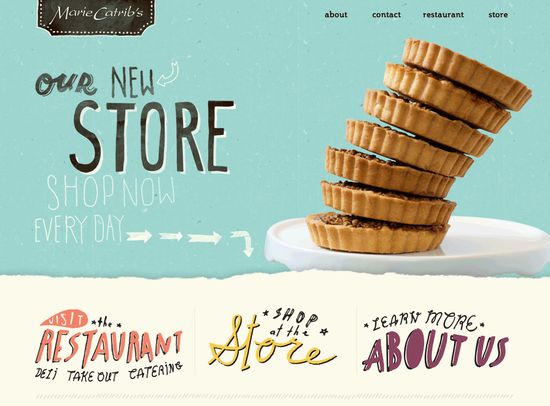
One of the most recent web design trends is incorporating hand-drawn elements into website projects. If you’re offering art services or your website is detected at fun-loving youngsters, adding your own design work in the form of doodles or drawings might turn out to be a big hit.
Depending on the audience you’re trying to reach, this web design trend can be a hit or miss. While it might not be suitable for finance or health-related websites, learning hubs and art stores can especially benefit from personally-drawn designs.
Doodles change the character of a web page and if you need an example, you can take a look at this article, listing the best web design ideas based on hand-drawn designs.
Gradients and Drop shadows
We’ve already established that some web design trends focus on minimalism while others favor more intricate designs. If you lack sufficient market experience, design can also have a middle ground. If you want to avoid flat design but still want to keep it simple there are things you can do to make that happen.
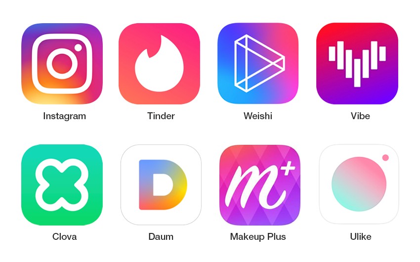
Gradients have been present in web design trends for a while now. A great example of the use of gradients is the logo of Instagram. Adding dual colors and drop shadows to buttons, headers and panels is a great UX/UI enhancement.
The trends in saturated colors, shading, and gradients have been started by some of the biggest brands on earth. Social media apps were the quickest to pick up this UX trend and users seemed to like them. If you’re thinking about reworking your color schemes next year, this evolution is not something you should skip.
Other Web Design Trends
Web design isn’t only about creating a breath-taking landing page. It’s also about all the nooks and crannies of your site, including UX writing, micro-interactions, and sub-sites that are only visited by the most inquisitive customers. There is more you can do to ensure a better user experience.
Next-level Questionnaires
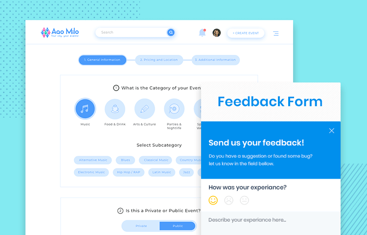
If you need to include a questionnaire on your site, make sure it’s not a plain and boring Google-forms kind of project. Would it be functional? Yes. Would it be fun? Probably not. Creative questionnaires are what users expect to see in web design in 2022.
Minimalism
We’ve discussed this before, but here it comes again. It’s up to you to decide what level of complexity you want to opt for in your web design project. Some things look better surrounded by white backgrounds and big black letters. Others need more going on to match the mood of the product. Assess your brand and what trends you want to follow and make an informed decision.
Organic Elements
Using nature and the beauty of the world around you is one of the trends that will only grow in prominence in 2022. Once again, depending on what your website is about or what your brand has to offer, organic design elements can be a significant enhancement to your website design.
Big Titles & Creative UX Writing
Internet users nowadays seem to appreciate the kind of web design that mixes small with big elements while creating a memorable web design. These trends are also prominent in UX writing, where a priority can be given to some information by making it bigger. If you want users to associate your brand with a powerful statement, why not display it proudly on the front page?
AI-driven Designs
AI isn’t always needed in web design. Managing a website doesn’t always call for intelligent features. But if your page has interactive features or functions with a certain goal, for example, a sketch pad or a photo-editing app, adding some intelligent elements might make your site significantly more attractive.
Smooth Transitions
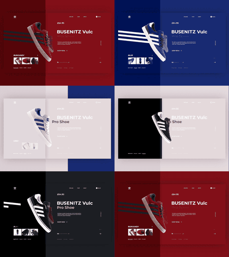
The bigger your site is, the more you need to think about making the UX design smoother and more efficient. With the internet speed increasing over the years, users care more about how fast they can surf the web. One of the biggest trends now is focusing on transitions. From one tab to another, from an article to the shopping cart… it needs to be smooth as butter.
Speed Optimization for Flawless User Experience
The ability to move around your site without obstructions is one step further from seamless transitions. Speed is an integral part of UX design. It’s not only about the placement of buttons and flawless UX writing. It’s also about how fast the page loads, including all of its sub-elements. Users no longer have the patience to wait 3 minutes for a site to load. You need to be faster.
Easier ID Identification
One of the UX/UI web design trends that are becoming increasingly important is easy ID. Users seem to prefer fingerprint/face identification in smartphone apps. Websites are usually excluded from that trend; however, it doesn’t stop people from wanting the impossible. Easy logins without annoying captcha but with the guarantee of security. Impossible or not, that’s something to consider.
Retro Style
Last but not least, the retro style is making a comeback! Web design trends, despite often being different from other trends, such as architecture or fashion, seem to follow in the footsteps of globalization. Retro style is almost everywhere now and while users don’t actually want slow loading websites from the past there is demand for retro accents and fonts which has become a big design trend.
Conclusions
Trends in the world of UI/UX design, as well as website design, are frequently changing. Just like the biggest corporations refresh their logos and designs every couple of years, you as a website owner or an aspiring designer should keep your finger on the pulse. Whether you’re redesigning something or building it from scratch, it’s good to keep the trends in mind.
In general, it’s always best to create a unified, congruent experience rather than experiment with whatever comes to your mind. Great designs have one thing in common – they all took a while to plan and the results leave nothing to be desired.
In 2022, make sure to follow the biggest web design trends and enjoy the success of your website!
Looking to drive traffic to your website?
Try advertising it on Zeropark!
Magdalena Bober


